Cascading Style Sheets (CSS) are a fundamental building block of web development. But as your project grows, managing styles across multiple files can become a nightmare. Enter modular CSS, a powerful approach that keeps your styles organised, maintainable, and free from conflicts.
Why Go Modular?
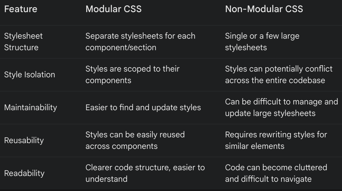
Traditional CSS often leads to a tangled mess of styles. Global stylesheets can become bloated, making it difficult to find specific rules. Worse yet, naming collisions can cause unintended consequences, leaving you with a visually broken website.
Modular CSS tackles these issues head-on. Here’s how it benefits you:
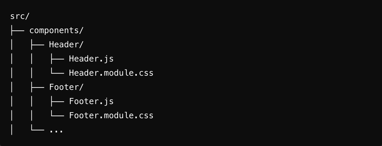
Imagine a collection of files on different shelves. Open the self and make the relevant changes in files separately

- Reduced conflicts: Modular CSS encourages you to create separate stylesheets for each component or section of your website. This isolates styles, preventing conflicts and making it easier to identify the source of any styling issues.
- Improved maintainability: With modular CSS, changes to a component’s styles are confined to its own stylesheet. This makes it easier to find and update styles, reducing the risk of unintended side effects elsewhere in your code.
- Increased reusability: Modular styles can be easily reused across different components. This promotes consistency and saves you time by eliminating the need to rewrite styles for similar elements.
- Enhanced readability: Well-organized modular stylesheets are easier to understand and navigate. This improves collaboration and makes it simpler for new developers to jump in and understand your codebase.
Putting it into practice
Getting started with modular CSS is straightforward. Here’s a general approach:
- Structure your stylesheets: Create separate CSS files for each component or section of your website. Use a consistent naming convention (e.g., button.module.css, header.module.css) to distinguish them.
- Embrace CSS modules (optional): Many frameworks like React and Vue.js offer built-in support for CSS Modules. These tools automatically scope your CSS selectors, adding a unique identifier to each class name, further reducing the risk of conflicts.
Import and apply styles: Import your modular stylesheets into the corresponding JavaScript or component files. Use the imported styles as objects to apply styles to your elements using the className attribute.
A step-by-step guide with code examples
Let’s walk through a practical example to solidify your understanding. Imagine we’re building a simple website with a header and a button component. Here’s how we’d approach it with modular CSS:
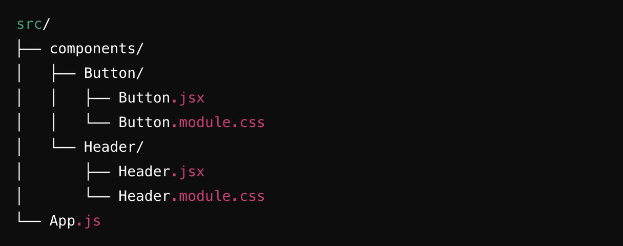
1. Create modular stylesheets:
Create two separate CSS files: header.module.css and button.module.css.
header.module.css:
.header {
  background-color: #f0f0f0;
  padding: 20px;
  text-align: center;
}
button.module.css:
.button {
  background-color: #4CAF50;
  color: white;
  padding: 15px 32px;
  text-align: center;
  text-decoration: none;
  display: inline-block;
  font-size: 16px;
  margin: 4px 2px;
  cursor: pointer;
  border: none;
}
2. Import and apply styles (using react as an example):
Create React components for your header and button. In this example, we’ll leverage the built-in CSS Modules functionality:
Header.jsx:
import React from 'react';
import styles from './header.module.css';

const Header = () => {
  return (
    <header className={styles.header}>
      <h1>My Website</h1>
    </header>
  );
};

export default Header;
Button.jsx:
import React from 'react';
import styles from './button.module.css';

const Button = () => {
  return (
    <button className={styles.button}>Click Me</button>
  );
};

export default Button;
3. Render the components:
In your main App component, import and render the Header and Button components:
import React from 'react';
import Header from './Header';
import Button from './Button';

function App() {
  return (
    <div>
      <Header />
      <Button />
    </div>
  );
}

export default App;
Not having modularized CSS:
Global Namespace Conflicts
Without modular CSS, all styles are in a global namespace. This means that class names can easily conflict, leading to unexpected styling issues.
Example:
You have two different components, Header and Footer, each with a class name title.
.title {
  font-size: 20px;
  color: blue;
}

.title {
  font-size: 15px;
  colour: grey;
}
When both components are used on the same page, the styles will conflict, and one will override the other, causing inconsistent styling.
Lack of reusability
With a global CSS file, it becomes difficult to ensure that styles are reusable without unintended side effects. You might end up duplicating styles to avoid conflicts, which leads to larger and harder-to-maintain CSS files.
Example:
You want to reuse a button style in different components but with slight modifications.
.button {
 padding: 10px;
 border-radius: 5px;
 background-color: blue;
 color: white;
 }
If you need a variation of this button, you might end up creating multiple classes like button-primary, button-secondary, etc., leading to code duplication and bloat.
3. Difficulty in maintenance
As the project grows, managing a single large CSS file or even multiple CSS files without a modular approach becomes increasingly difficult. It is hard to track which styles are used where leading to unused or redundant CSS.
Example:
/* styles.css */
.header { ... }
.footer { ... }
.card { ... }
.button { ... }
/* hundreds of lines later */
.unused-class { ... }
Finding and removing unused styles becomes a daunting task and the risk of accidentally removing needed styles increases
Scaling Issues
When working on a large team or a growing project, having a global CSS file can cause issues in collaboration. Multiple developers working on the same file can lead to merge conflicts and difficulty in maintaining consistent coding standards.
Example:
In your main App component, import and render the Header and Button components:
/* Header.module.css */
.title {
  font-size: 20px;
  color: blue;
}

/* Footer.module.css */
.title {
  font-size: 15px;
  colour: grey;
}
Each component imports its styles:
// Header.js
import styles from './Header.module.css';

function Header() {
  return <h1 className={styles.title}>Header</h1>;
}

// Footer.js
import styles from './Footer.module.css';

function Footer() {
  return <h1 className={styles.title}>Footer</h1>;
}
What about too Many CSS :
When you have many CSS files, one for each component, it can lead to challenges in maintenance and organization. However, there are strategies to manage this effectively:
- File Structure Organization: Create a clear and consistent folder structure. For example, group component styles within the component’s directory.
- Put the global once and Overrides in separate global file: We are using Modular CSS to make the CSS local to its component so it can be plugged and played. But your project will require some global styles also definitely, so put it inside the global styles.
CSS Now if you still want to write less CSS code then you have to opt for non modular or side by side you can use SCSS, which we will cover in our next blog.
Modular CSS is a practice of writing CSS in a way that is more maintainable and scalable, especially for larger projects. Here are some best practices for using modular CSS:
- Use CSS modules:
- CSS Modules provide a way to write CSS that is scoped locally to the component. This helps to avoid naming conflicts and ensures styles are applied only where they are intended.
- In a React project, you can create CSS module files with a .module.css extension and import them into your components.
- BEM (Block Element Modifier) naming convention:The BEM methodology is a popular naming convention that makes the structure of your CSS clear and maintainable.
- CSS-in-JS:Libraries like styled-components, emotion, and others allow you to write CSS directly within your JavaScript code. This promotes modularity by keeping styles scoped to the components.
- File structure:
- Organize your CSS files by components. Each component should have its own CSS file or module.
- Minimise global styles: Minimize the use of global styles. Use them only for resetting defaults and setting base styles.
- Use a CSS reset or normal CSS at the start of your global styles.
- Variables and mixins:
- Use CSS variables (custom properties) or preprocessor variables (Sass, Less) to define commonly used values like colours, font sizes, and spacing. This promotes consistency and makes changes easier.
Examples :
1: Use CSS Modules:
import styles from './Button.module.css';

function Button() {
  return <button className={styles.button}>Click me </button>;
}

2:BEM (Block Element Modifier) Naming Convention:
.button { ... }
.button__icon { ... }
.button--primary { ... }

3:CSS-in-JS
import styled from 'styled-components';
const Button = styled.button`
  background: blue;
  color: white;
  border-radius: 5px;
`;

function App() {
  return <Button>Click me</Button>;
}
4: FIle structure
Conclusion:
A Simpler Styling Experience. Modular CSS offers a clear advantage over traditional approaches. Let’s take a closer look at the key differences between modular and non-modular CSS and you decide the conclusion, of what your project needs.
Look out for further blogs in this series to learn more.
Part 2: How to write SCSS with Modular Code (Coming Soon)
Leave a Reply